
Brand Positioning, Messaging
and Visual Identity
CASE STUDY
Academic Unit Brand Positioning
Refresh and clarify the brand of the Franke College of Forestry and Conservation, a 100+ year-old institution, making it compelling and relevant to new and diverse audiences while honoring its legacy.
-
Conducted a comprehensive brand audit, reviewing the college’s history, logos and communications materials.
Developed clear guidelines for logo usage and brand application, ensuring consistency across all college communications.
Reintroduced the centennial logo, aligning it with the University of Montana’s legacy color palette to celebrate history while creating a modern visual appeal.
Collaborated with individual units and programs within the college to refresh their sub-branding, establishing distinct identities that remained cohesive with the university’s overall brand strategy.
Clarified brand purpose, key audiences and messaging priorities to guide all communications and support strategic decision-making.
-
Created a unified yet flexible brand framework that strengthened the college’s identity and visual presence.
Enhanced recognition and engagement among prospective students, current students, partners and donors.
Provided the college and its programs with practical tools and guidance for consistent, strategic communications.
CASE STUDY
Visual Identity Refresh
Refresh and modernize the visual identity of the UNCG School of Health and Human Sciences to better reflect its values, audiences and institutional context, while maintaining alignment with the university brand.
-
Conducted a brand review to understand the school’s existing identity, audiences and communication goals.
Developed a refreshed visual identity using the university’s secondary color palette, creating a modern, cohesive look for all communications.
Trained faculty and staff on proper use of the refreshed brand elements, ensuring consistency across materials and platforms.
Collaborated on refining and promoting the school’s tagline to enhance clarity, recognition and impact.
Clarified messaging priorities and supported strategic communication practices
-
Delivered a visually refreshed and consistent brand that resonates with internal and external audiences.
Strengthened faculty and staff confidence in applying the brand through training and clear guidelines.
Enhanced visibility, clarity and cohesion in the school’s communications, supporting recruitment, engagement and institutional recognition.
CASE STUDY
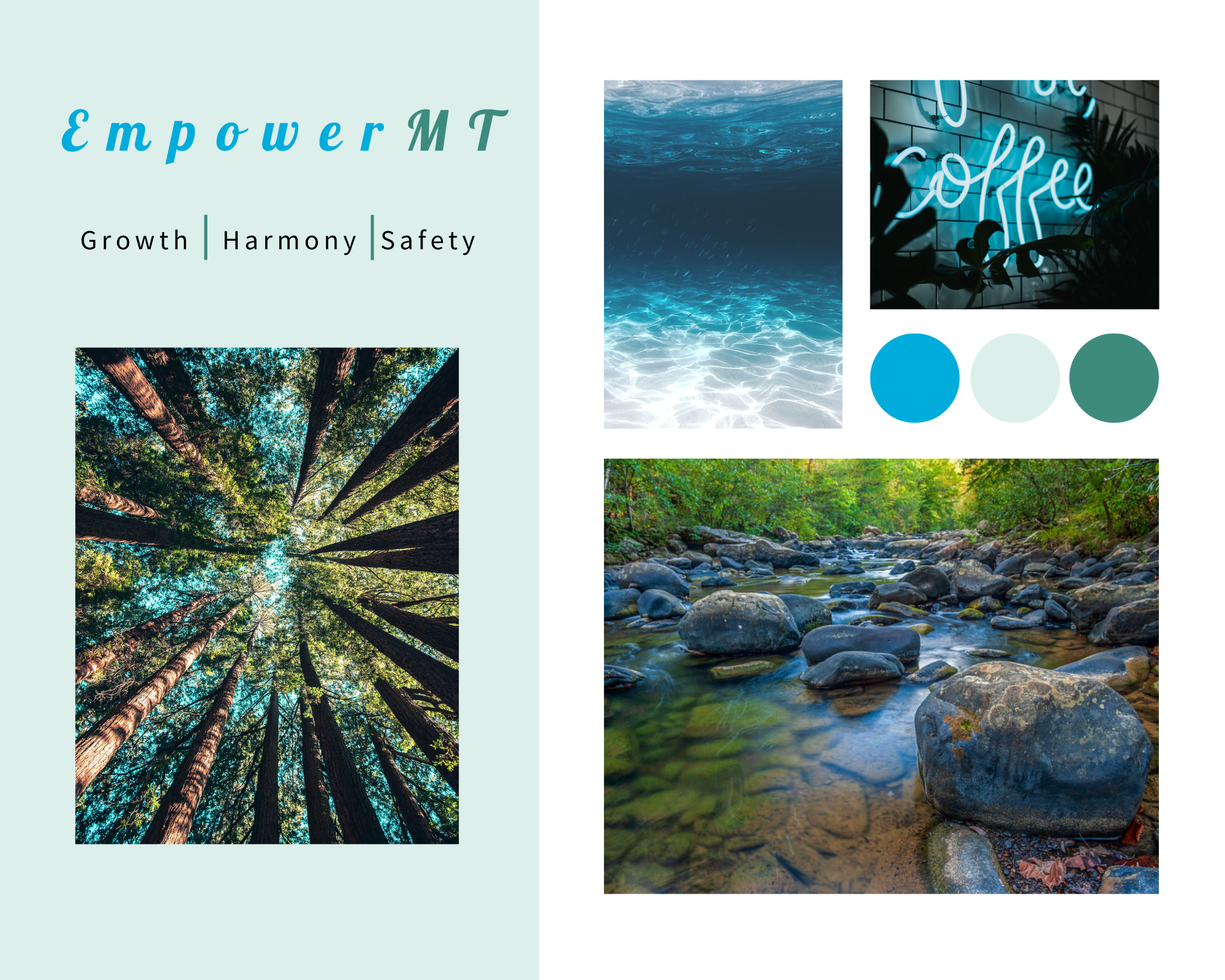
Nonprofit Brand and Marketing Refresh
Strengthen EmpowerMT’s brand profile in Missoula and beyond, modernize its visual identity and streamline marketing efforts to allow staff to focus on programming and development.
-
Reviewed existing e-marketing materials and analytics to develop a targeted email marketing strategy.
Designed a refreshed visual identity, including a new logo, color palette, mood boards
Updated staff bios and created templates for business cards, letterhead and monthly e-newsletters.
Conducted training and marketing check-ins to support consistent brand and messaging use.
-
Facilitated a branding workshop with staff to clarify values, audience and communications goals.
Developed mood boards and color options for staff feedback, leading to a refreshed logo and brand style guide.
Created an individualized e-marketing strategy, including Mailchimp templates, monthly newsletter content and bio updates.
Conducted research on e-news platforms and provided recommendations for ongoing marketing strategies.
Provided recommendations for long-term marketing improvements, including content calendars, social media engagement strategies and potential investment in advertising and web tools.
-
Delivered a modern and cohesive brand identity that balances warmth, credibility and mission alignment.
Streamlined e-marketing processes, saving staff time and ensuring consistent communications.
Provided practical tools and guidance for ongoing email marketing, social media, and brand management.
Revised staff bios, designed templates and offered strategic recommendations for future growth and marketing efficiency.